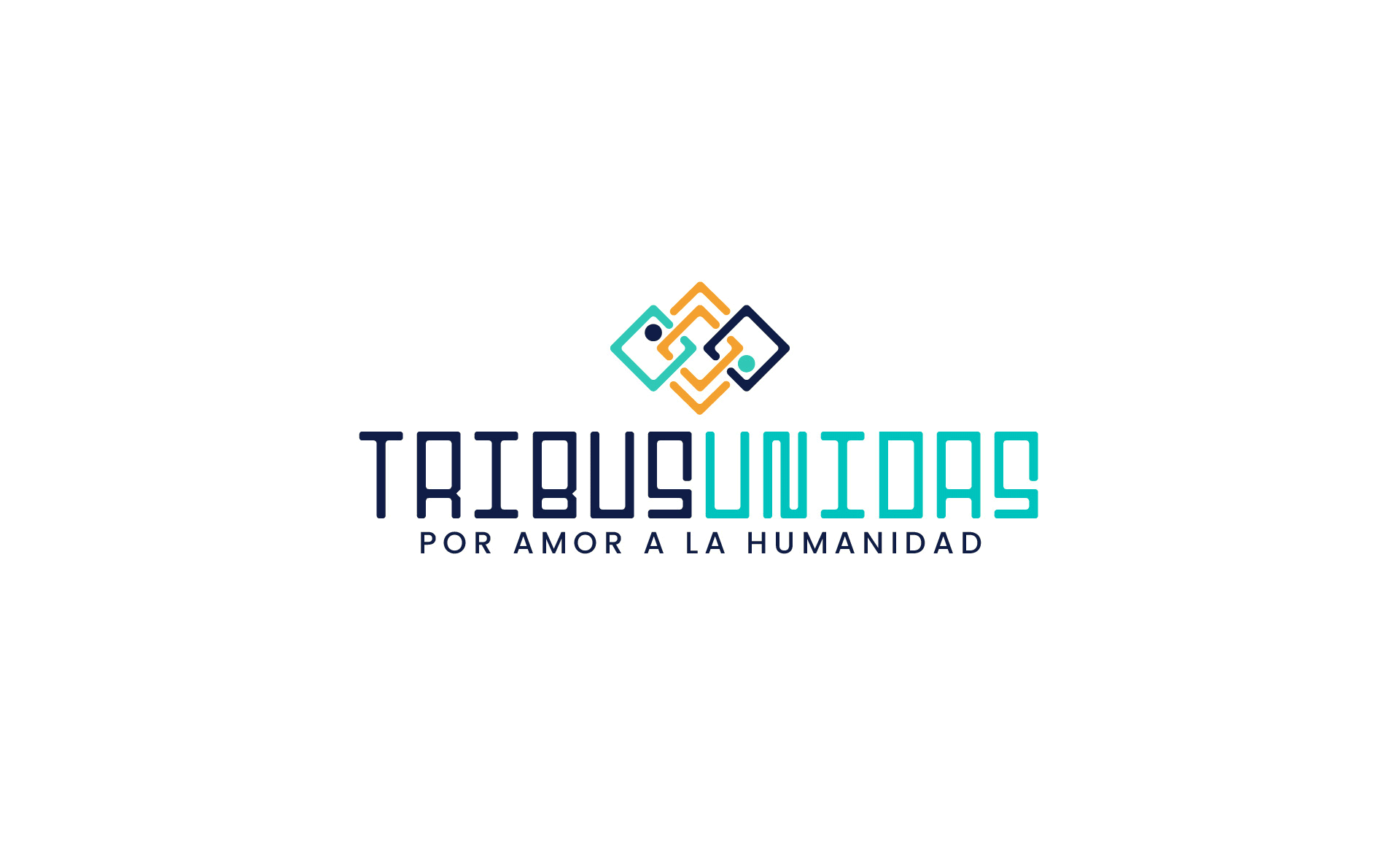
Brand Creation:
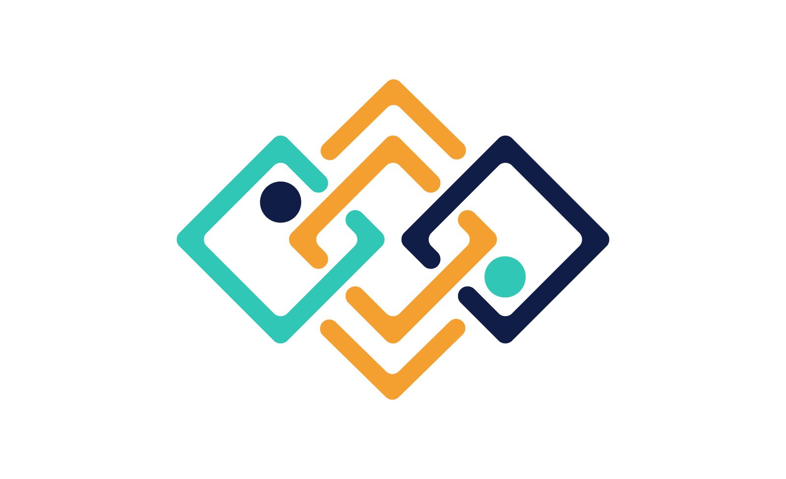
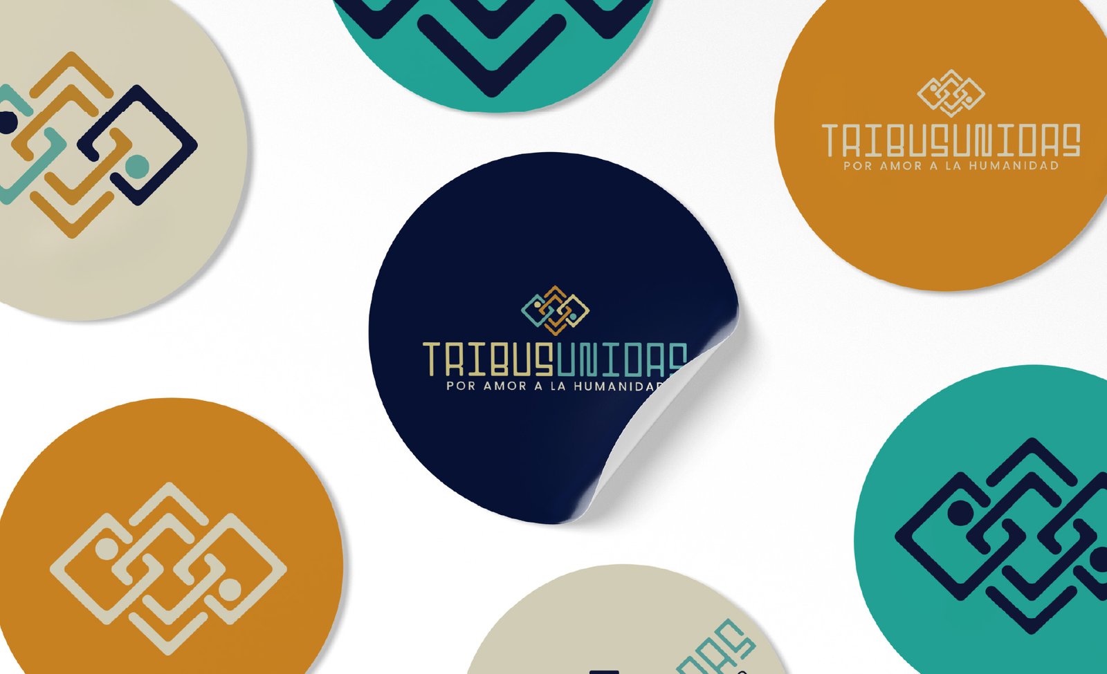
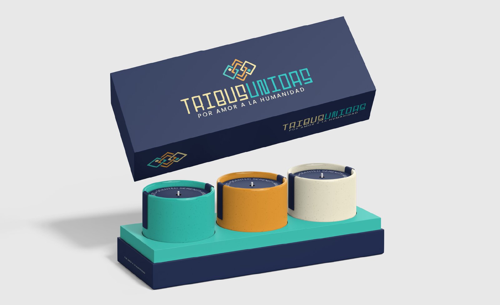
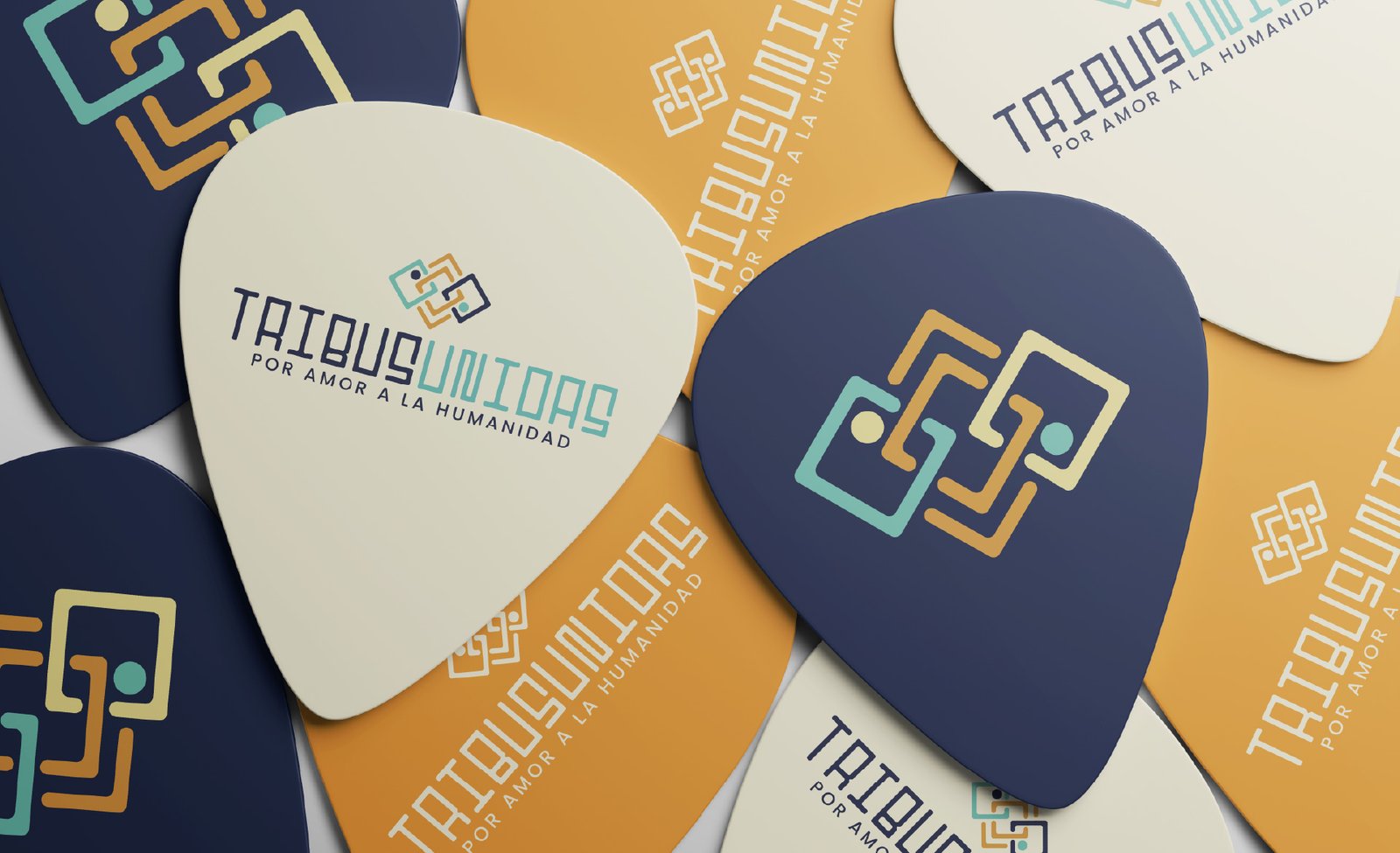
The brand uses a geometric, modern sans serif typeface that reinforces a clean, trustworthy, and professional identity. The symbol consists of three interwoven rhomboid shapes, each with a central dot representing the human being. This abstract design symbolizes unity, diversity, and the interconnectedness of different cultures or communities.
Each shape represents a unique identity, and their connection reflects a network of relationships where difference enriches. More than just a brand mark, the symbol conveys a message: the importance of serving, healing, and building collective well-being together.